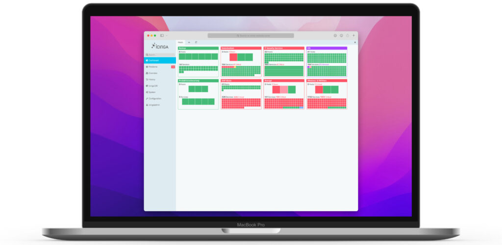
I designed a Tactical Overview widget for the Icinga Web dashboard.

Ideation
Donut charts enable one to have a lot of information in a compact format. As a nice side effect, they breaks up the rectangularity of typical UI elements, which makes them more interesting to look at.
Since we need to both display hosts and services, one approach was to combine two donut charts into one.

After some fine tuning and putting it in context, it turned out that this wasn’t quite appropriate. The graph is too detailed.


With these learnings I went back to the drawing board and focussed more on these points:
Redesign
- the amount of problems in relation to the total number of objects
- make it graspable at first sight, if there is a problem
- make the number of actual problematic objects obvious
While the first bullet was solved pretty well by the donut chart, it was not capable of fulfilling the remaining. It was clear, that donut chart are not suitable for complex or detailed data, so I went back to rectangles.

There are different grades of detail for the objects squares. So when there’s only a few they’re display pretty large. This makes it easy to grasp how many there are on the spot. The more objects there are the less important the actual number of items becomes.

The final mockup clarifies, that this approach is a lot more balanced between »first glance« rough information and »second glance« detail information.

To get even more detail information, the user can interact with certain parts of the widgets as well, which would lead him either to a list of object or a detail view. Also there’s a tooltip showing the actual name of the object, when hovering a tile.


