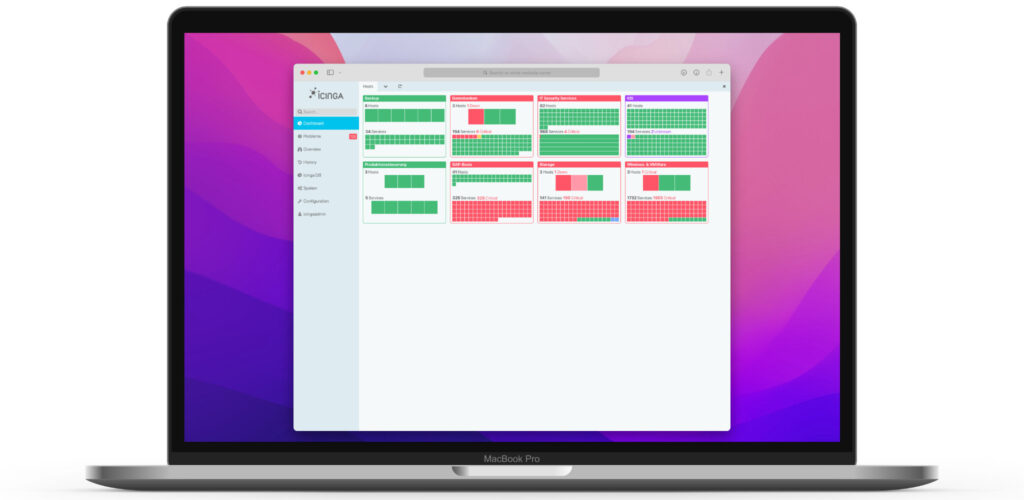
I designed a Tactical Overview widget for the Icinga Web dashboard.

Ideation
Donut charts enable one to have a lot of information in a compact format. As a nice side effect, they breaks up the rectangularity of typical UI elements, which makes them more interesting to look at.
Since we need to both display hosts and services, one approach was to combine two donut charts into one.

After some fine tuning and putting it in context, it turned out that this wasn’t quite appropriate. The graph is too detailed.


With these learnings I went back to the drawing board and focussed more on these points:
Redesign
- the amount of problems in relation to the total number of objects
- make it graspable at first sight, if there is a problem
- make the number of actual problematic objects obvious
While the first bullet was solved pretty well by the donut chart, it was not capable of fulfilling the remaining. It was clear, that donut chart are not suitable for complex or detailed data, so I went back to rectangles.

There are different grades of detail for the objects squares. So when there’s only a few they’re display pretty large. This makes it easy to grasp how many there are on the spot. The more objects there are the less important the actual number of items becomes.

The final mockup clarifies, that this approach is a lot more balanced between »first glance« rough information and »second glance« detail information.

To get even more detail information, the user can interact with certain parts of the widgets as well, which would lead him either to a list of object or a detail view. Also there’s a tooltip showing the actual name of the object, when hovering a tile.


Netways Web Services (NWS) offers managed open source tools as software as a service (SaaS). This means that they offer optimized standardized setups of open source software tools, that customers can subscribe to.
Starting up with simpler applications like GitLab, Rocket.Chat, Jitsi and of course Icinga, the offered SaaS products became more complex with the addition of Kubernetes and Virtual Private Cloud. The latter is based on the Cloud Computing Infrastructure Management tool OpenStack.
The Goal
The goal of the project was to develop a UI design system for the customer facing management interface. The management was designed to only handle basic configuration and info for the app offerings.
One key requirement was for the system to be scalable, so that the user interface was capable of managing the addition of future products.
My role was to develop the UI concept in cooperation with the product owners and implement a toolkit of reusable UI elements, so that the team can further implement new interface sections for the app, when new product offerings were added.
Requirements
Branding
Colors and type
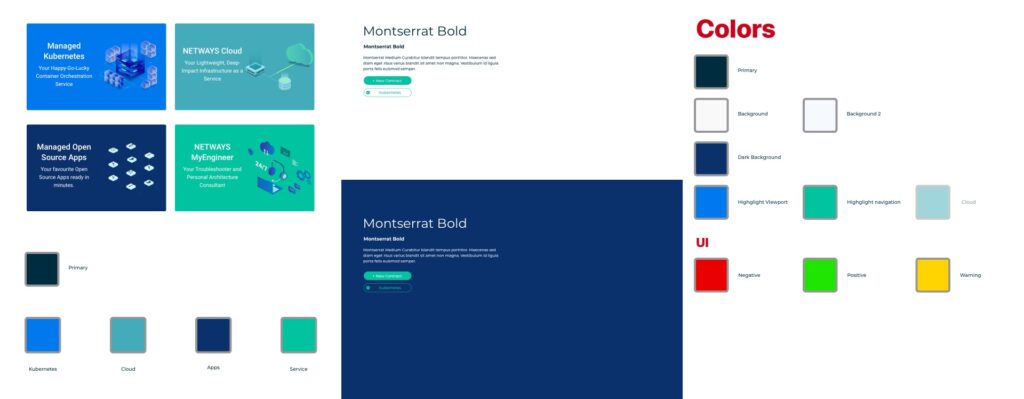
I used the already available color set of the marketing pages for the branding of the customer center. For the font I was looking for a modern, sans serif typeface that is readable at smaller sizes. It should also look fresh and have character in opposition to commonly used UI fonts.

The products

Main navigation
The app features a sidebar, which made it pretty versatile in the amount of items it can hold.

The Sidebar
Besides the main menu holding the users products, the sidebar also contained a quick add menu. Not only does it give a quick overview about the offerings, it makes adding new products and resources easily accessible.
It should also make MyEngineer one of the key features easily accessible from each view. MyEngineer is the support feature of NWS and comes with every plan. The customer can get quickly in contact with one of the support engineers.
Clear Usability and User Guidance
Besides simple SaaS products, there were some more complex products offered. Even if the customer won’t grasp the full feature set and possibilities, the portal offers a streamlined onboarding for the latter. The interface directs the user step by step and offers descriptions of the attributes the user can set.

The announcement of macOS Big Sur’s new app icon style guide really made me want to play around with icon design again.
It was obvious for me to start with the Icinga logo for a little Sunday morning exercise.


Icinga Web is the web interface for Icinga. Although a lot of the features of Icinga are better used via command line, this cumulates most of the day to day functionality in a user friendly graphical interface, that even non technical people can use.
The central part of Icinga Web is the monitoring module, which had to be completely rewritten to work with the highly anticipated Icinga DB, which is the new database interface for the Icinga core. This was the chance for a fresh UI redesign.
For the first version we wanted the new UI to be more consistent, visually clearer and provide more viewing options.
With the Icinga Rebrand to be rolled out, we wanted the Icinga Web user interface to reflect the new visual language. Since the new branding was mostly light on dark, I prepared drafts for a dark theme for Icinga Web.
Theming was an integral part of how Icinga Web was built. But we also wanted to adapt the UI to the Browser preference and enable an automatic switching, which required some extended functionality.


Defining a color palette
The first step was to define a rough color palette. Sidebar and viewport background were the first, since it was the most prominent color for the theme. We kept the status colors, but went for a new primary accent color.

Refining the palette
After I found a harmonious palette for the start, I implemented the new themes, so I could immediately see, how the colors work. Since the base background color of the viewport wasn’t pure white/black, I started tuning the grays and tinting them with subtile blue-ish shades.
Introducing Theme Modes
In addition to separate themes, we found that there has to be a relation between the flavors of a theme, a.k.a. light and dark mode. So the development team extended the theming engine with theme modes, enabling theme developers to define separate versions of their theme depending on the user’s preferred color-scheme.
I helped them implement the themes for the new engine. In the implementation process we did some further refinements and tidied our whole variable system to reflect a proper palette system and rename the variables accordingly.

Website design and WordPress implementation for Lena Neuberger.
The website has been handed over and has since then been managed by the customer.


After the decision, that we needed new Icinga community shirts I took the chance to bring our apparel design to the next level and came up with multiple drafts.
Rather than having just a one time give away, I aimed for more sustainable t-shirts. We would use proper high-quality materials, full color print and colorful appealing visuals – something that our community members actually love to wear.

Variations
Our product manager tended more towards a simple and basic approach, so I started with simple logo placements and variations thereof.

After some ideating, I was urged to make the shirt designs more original. Since the people wearing it are pretty familiar with Icinga I tried to bring more of Icinga personality into the designs. In the end those would be the main target group that should love to wear the shirts. Wearing them should make them proud of being part of the Icinga community.
My first approach to make the design more special was to ideate with the monitoring states that is pretty central to using Icinga. Every Icinga user would know what an OK or an UP state means.


It also turned out pretty appealing to use the state colors combined in a more abstract way. Even if I liked the nerdiness of the »fun with states« drafts, we agreed that it would be more practical to have a more generic shirt design that also featured the logo prominently.


Sewobe is the development company behind the most popular German association management software.
The software itself is highly modular. This project was a complete big visual overhaul of their man products. Especially the end user facing interfaces got a lot friendlier and clearer.
This challenge was to develop a solid design system, that provides reusable user interface components. The software itself consists of different small modules, so it was important to have a main menu with a flexible structure. The UI was should also adapt to mobile layouts, while still providing all its functionality.
Setting a consistent product character

Modular interface framework


The Website of Berlin based Deutsche Arbeitsgemeinschaft für Handtherapie (German Work Association for Hand Therapy) is a heavily custom developed site based on WordPress.
It offers a member management system so that assocition members can log in to the backend and register their offices.
The private members area also features special downloads, like for example the monthly update as pdf and many more custom material.
Heart of the site is the register for qualified hand therapy members. It’s an interactive map built based on the Google Maps API (v2). The view of the map works in conjunction with the search functionality, so map intelligently frames the currently filtered hand therapy offices.
The project was handed over to the client in 2017 and since then managed and further developed by them.


For the local non-profit organization »Faraja« heißt Trost (»faraja means solace«) I was asked to make a website, were they can publish basic information about the organization and post current news about the project.
The organization was founded by remedial teachers Marianne and Reinhard Penn. With the founding they wanted to give disabled young people in multiple schools in Tanzania a new life perspective. They conduct funding events and support the schools with helping their students in their daily life.
Content Management with WordPress
The main goal was to have the founders manage the site’s content themselves. So we decided to use WordPress as the basis.
The Website design
The organization already had some pretty well designed print material. I wanted the site to reflect this and stick to the visual elements of the print design.
I also didn’t want to use a generic theme, so I developed a custom one.


Make the site work on mobile
With smart phones coming more and more into the mainstream, it was also important to make the site usable on a phone. Therefore I created a collapsible mobile navigation the makes space for the content on the limited screen space.
